A**Y
Full of Beautiful Lettering
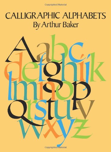
This book was just as its name suggested - full of beautiful, well depicted, calligraphic ideas. My husband uses it to get ideas for his art projects.
D**H
Good book to have for a graphic designer or a calligrapher
A must have if you are working on lettering or plan to do some work on this topic. good examples, quite complete
D**V
Horrific
I got two Arthur Baker calligraphy books: this one and its companion, Historic Calligraphic Alphabets. Both were not merely disappointing but actually sort of upsetting, as much as this sort of thing can be anyway. Apparently Baker is either the genesis of or at least a major purveyor of a 1970's style of calligraphy which you may be familiar with from plaques you see in old people's kitchens with trite inspirational messages. That's the only thing it's really suited for, anyway. This WHOLE BOOK is filled with the same two hands over and over again. It bills itself as being a collection of various contemporary alphabets but it's actually two alphabets done with different nib sizes and with varying degrees of carelessness. The idea is that it's free and fast, I guess; the effect is that it's ugly and a total hack job. You know how someone who can't draw human hands will always draw people with their hands in their pockets? That's what the lowercase g's are like throughout this book -- Arthur Baker, for whatever reason, cannot draw g's. There's a letter where the g is supposed to be, I guess, but he's hoping you won't notice that it barely qualifies as one, much less an artful one. Capital A's are similarly routinely flubbed. How could this have been published?I expected the historical book to be better, since it intends to demonstrate known styles. While it is much more varied, of course, similar complaints apply. Liberties (i.e. regressions to the author's one hand) are taken that tend to make disparate styles all look a little too appropriate, again, for inspirational wall plaques. The rotunda is a good example of it, as it manages not only to miss the spirit of the style entirely but also to get so many technical details flat out wrong -- outward curves where they should be inward, symmetry where there shouldn't be, unconnected strokes where they should be connected, etc.Beware any product from this author.
Trustpilot
2 weeks ago
1 week ago
