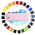
🎨 Paint Your World with Paul Rubens - Where Every Stroke Tells a Story!
The Paul Rubens Professional Watercolor Paint Set features 24 artist-grade colors made with ultra-pure pigments, ensuring high transparency and strong tinting. Packaged in a lightweight, portable metal box, this set is perfect for artists, beginners, and hobbyists alike, offering customizable color arrangements and a built-in mixing palette for ultimate convenience.


| Brand | Paul Rubens |
| Color | 24 Colors |
| Finish Type | Watercolor Paint |
| Size | 24 Count (Pack of 1) |
| Item Volume | 308 Cubic Centimeters |
| Special Feature | Lightweight |
| Unit Count | 24 Count |
| Paint Type | Watercolor |
| Specific Uses For Product | Water coloring paint |
| Surface Recommendation | Metal,Tin |
| Indoor/Outdoor Usage | Indoor |
| Item Form | Solid |
| Included Components | Palette |
| Age Range (Description) | Kid,Youth,Adult |
| Is Waterproof | False |
| Package Information | Box |
| Coverage | Lightweight |
| Water Resistance Level | Not Water Resistant |
| UPC | 710382908992 710382907681 |
| Manufacturer | Lightwish |
| Part Number | Muti-colors |
| Item Weight | 14.9 ounces |
| Product Dimensions | 9.21 x 3.39 x 1.42 inches |
| Item model number | 4336972344 |
| Is Discontinued By Manufacturer | No |
| Finish | Watercolor Paint |
| Material | Metal |
| Item Package Quantity | 1 |
| Special Features | Lightweight |
| Batteries Included? | No |
| Batteries Required? | No |
C**.
Beauty is not just skin-deep with this set!
This is a great set for the price. I would recommend this set for beginner artists, crafters, or even more seasoned artists who would like an inexpensive but decent quality paint to practice with.The outside: The packaging for these paints is so nice. It arrives in a very cute cardboard box, and inside the box it is wrapped in a pink microfiber cloth. The metal palette itself is very pretty, and honestly the main thing that drew me to this product in the first place.The inside: All of the half-pans come wrapped with a sticker label that includes the name, pigment information, and lightfastness of each color. In the photos you can see that I stuck these onto a piece of paper to keep as a reference. There is also a swatch card included in the box, which is printed on a sheet of watercolor paper.The paints: They're student grade paints, but the colors are all very vibrant and punchy. For the most part they rehydrate easily, but they don't dissolve so easily that you find yourself quickly running out of paints.I have three student grade watercolor sets (these paul rubens, Winsor and Newton Cotman 12 half pan set, and a set of arteza tubes). Out of those 3 this set is easily my favorite, due to the ease of use and the quality of paints. They are not chalky like the arteza, and they're more pigmented than the cotmans in my opinion.I like the color selection you receive with this set. This particular set has:3 yellows.3 reds.5 blues.With this number of primaries (a nice assortment of cool and warm tones for each), you can mix almost any color you would possibly need. However, you also get a huge variety of secondary colors and tertiary colors, including:2 violets.4 greens.5 earth tones.2 neutrals.Also, while we're at it, I'll tell you that out of these 24 colors, 20 of them consist of a single-pigment (including every single one of the primaries). 3 of the pigments are made up of a combination of two pigments, and only 1 color is made up of three pigments.If you are a person who tends to prefer single pigment colors, or if you're interested in learning how to mix colors, this is a great set.Tldr; this set is not only pretty on the outside! You definitely won't be disappointed with the contents of this cute palette.
D**.
Made me love watercolors again! *Technical stuff in Review*
LANGUAGE SOLUTION: I just want to preface this with saying, people, the color/pigment info is in English on this exact listing, in the images (NOT the Product Description, but at the TOP of the page within the image slideshow.) Reference the pigment info on the half pan wrapping with the pigment listed in the third image on this listing page! If the wrapper for the sky blue says "PB36" with a number “8” in the next line, look at the image and you'll see that the Sky Blue color is indeed that exact color with having PB36 as a pigment and a Lightfastness of 8. Do that for each color.I have an image that can help as a guide in this review. You can also use your phone camera with a translator to translate it in English for you.Trust me, I was lost at first but it was not hard to realize that the brown color with PBr7 and PR101 and 8 on its wrapper was the "Umber" color in the color chart image on this listing. Don't let the language distract you from testing out whether the paint was worth your buy! The language isn't the selling point, the paint is! Returning the paint because the language is Chinese and just because PR is a Chinese brand is.. kinda weird.With that, hope my review below helps!_______________This watercolor set is really amazing for the price! Originally, I was going to buy $100+ worth of watercolor tubes and supplies, but I decided on getting this 24 set after coming across some videos reviewing it. I noticed that PR sells two versions of the 24-set in their "Professional" line. The one I bought has metal-based pigments with Cadmium and Cobalt, and doesn't have a white.It's wild how amazing this set is for the price listed. PR probably adds some sort of white filler in the colors, and it may be noticeable to some experienced watercolor painters, but it didn't hinder the vibrancy and saturation of the colors. The colors are easy to blend, they don't mud so easily and they don't patch up on the surface either. Compared to other cheap watercolors around this price, the fillers are honestly barely noticeable (if there are any fillers) and it's like painting with more expensive professional grade watercolors. Fillers are a big deal to me (esp with gouache, i'm *very picky* with paint w/o fillers, opacifiers) and I'll tell you these paints are worth it if you are a beginner.Pros of this set are that the colors are vibrant, they rewet easily and go on smoothly. The color selection is great, but the Madder Red is made with PR177 and it's not a lightfast pigment. Kimberly Crick tested the lightfastness of these pigments on her website, and the Madder Red fades. Prussian Blue PB27 is also a pigment that fades, but I appreciate that the company didn't rate it a 7 or 8. The Indian Yellow (PY83) is given a 7, but the pigment used fades when diluted throughout many brands. These three colors are absolutely gorgeous but I would relegate it to sketchbook work if you worry about lightfastness.Fugitive pigments/pigments prone to fading are listed below (tested by Kim Crick):1) PY83 Indian Yellow2) PR177 Madder red3) PB27 Prussian Blue (fades in strong light, but recovers in darkness, tread carefully)4) *NOTE* PG36 PY12 PR101 PW5 Tree Green in this set is prone to fading, but the same color listed elsewhere in the PR Watercolor catalog lists Tree Green with PG7 PY3 PR101 PW4 (lightfast pigments, PY3 being less lightfast but okay), but to be safe I put it away.A little extra info: I modified the palette and removed the Coal Black (PBK7), Paynes Grey (PB15, PB29, PBK9) and the Pozzuoili Red Ochre (PR101), and replaced it with a full pan of Zinc White, and a half pan of Titanium White (both whites were from another brand). Later proceeded to remove the Prussian blue, Indian Yellow, Tree Green, Violet, Scarlet, and Madder Red and will replace them with similar colors from this same Paul Rubens brand (the replacement colors were bought from another website). Also put away the Burned Sienna because the hue can be mixed with Umber and Burned Brown.Fun fact, an extra half pan can fit in the middle slot of the palette, but sideways.Overall, this set is great, and vibrant colors and clean mixes it makes for the listed price makes it even better! If you want to use it for professional work, I believe using a scanner to reproduce the image, replacing the fugitive colors with lightfast alternatives, or removing the fugitive colors entirely and using just the colors that are actually lightfast will suit you well. If you are using this product for practice, sketchbook works, or for projects that don't require lightfast paints, this will be absolutely perfect. I do not regret purchasing this set, and from a person that hasn't painted with watercolors in a long time, this made me fall in love with the medium again!____________UPDATE:In order to shorten the (now gone) updates, I'm just gonna recommend some palette changes.Colors I replaced (replacements are lightfast)1. PY3 Lemon Yellow —> PY35 Cadmium Lemon Yellow (virtually the same color but lightfast)2. PY83 Indian Yellow —> PY110 Permanent Dark Yellow (virtually same color but lightfast)3. PR123 Scarlet —> PR254 Chinese Red (Ferrari Red, more vibrant counterpart, lightfast and reliable)4. PV19 Red Violet —> PR122 Magenta (very lightfast according to handprint’s tests, more saturated than PV19, makes better purples with Ultra Blue)5. PV23 Violet —> PV15 Ultramarine Violet (more lightfast and more saturated)6. PG36 PY12 PR101 PW5 Tree Green —> PG50 Cobalt Green (less dark valued but completely lightfast and a nice green)Other colors I recommend adding are1. PY150 Nickel Yellow (a duochrome yellow, earthy in masstone, but becomes a vibrant lemon-mid yellow when watered down. Nice for green mixes and painting light)2. PB36 Cobalt Turquoise Light (lightfast and vibrant color, great for sky blues, sea tones and green mixes)3. PW4 Zinc White & PW6 Titanium White (not a watercolor purist, white is okay to use. I bought different brands. PW4 for mixing and PW6 for highlights. Don’t overuse these)Other colors I removed but didn’t replace1. PR177 Madder Red (gorgeous color but not lightfast at all. Recommend it for sketchbook use)2. PB27 Prussian Blue (beautiful color but lightfastness is iffy. Recommend it for sketchbook use)3. PG17 Chromium Green Oxide (oddly enough this usually lightfast color fades in this brand, but like Prussian Blue it regained its normal look after some time away from light. Very iffy, so removed)4. PB15 PB29 PBk9 Payne’s Grey & PBk7 Coal Black (you don’t need to remove them but I do recommend mixing your dark colors without pigment black)
Trustpilot
4 days ago
2 weeks ago